RGB(252, 237, 224) Color Code - Pot Pourri
| HEX | #FCEDE0 |
| RGB Percent | 98%, 92%, 87% |
| RYB | 252.0, 248.27, 224.0 |
| CMYK | 0, 6, 11, 1 |
| HSV | hsv(28, 11, 99) |
| HSL | hsl(28, 82%, 93%) |
| HSLA | hsl(28, 82%, 93%, 1.0 |
| HSLuv : HUSL | 50.76, 79.71%, 94.59% |
| Android | 4294766048 / 0xfffcede0 |
| Binary Value | 11111100, 11101101, 11100000 |
| Decimal Value | 16575968 |
| Octal Value | 77166740 |
| Hunter Lab | 93.09, -2.05, 12.42 |
| Hex8 Value | #FCEDE0FF |
| XYZ | 83.88, 86.65, 82.81 |
| xyY | 0.331, 0.342, 0.342 |
| YIQ | 240.003, 13.1154, -0.8731 |
| LMS | 85.24, 88.58, 82.87 |
| YUV | 240.003, -7.87, 10.52 |
| YDbDr | 240.003, -24.08, -22.82 |
| YCbCr | 222.12, 120.07, 135.52 |
| YCoCg | 237.5, 238.0, -0.5 |
| YPbPr | 240.0, -9.03, 8.56 |
| CieLAB | 94.59, 2.92, 8.11 |
| CieLUV : LCHuv | 94.59, 9.52, 11.66 |
| CieLCH : LCHab | 94.59, 8.62, 70.2 |
RGB(252, 237, 224) Color Code name is Pot Pourri. #FCEDE0 HEX Code RGB percentage is 98% Red, 92% Green and 87% Blue. #FCEDE0 Hex Code RYB Percentage is 98.82% Red, 97.36% Yellow, 87.84% Blue. CMYK Color Model of #FCEDE0 is 0% Cyan, 6% Magenta, 11% Yellow, 1% Black. HSL (Hue, Saturation, and Lightness) Color Modal of #FCEDE0 is hsl(28, 82%, 93%) and HSLA (Hue Saturation Lightness Alpha) of #FCEDE0 is hsl(28, 82%, 93%, 1.0) and HSV (Hue, Saturation, Value) is hsv(28, 11, 99). A Three-Dimensional XYZ value of #FCEDE0 is 83.88, 86.65, 82.81.
Decimal of #FCEDE0 is 16575968, Octal of #FCEDE0 is 77166740 and Binary of #FCEDE0 is 11111100, 11101101, 11100000 and Android of #FCEDE0 is 4294766048 / 0xfffcede0. The CIE xyY Color Space of #FCEDE0 is 0.331, 0.342, 0.342 and YIQ Color Space of #FCEDE0 is 240.003, 13.1154, -0.8731. The Color Space LMS (Long Medium Short) of #FCEDE0 is 85.24, 88.58, 82.87. CieLAB (L*a*b*) of #FCEDE0 is 94.59, 2.92, 8.11. CieLUV:LCHuv (L*, u*, v*) of #FCEDE0 is 94.59, 9.52, 11.66. The cylindrical version of CieLUV (CieLCH : LCHab) of #FCEDE0 is 94.59, 8.62, 70.2. #FCEDE0. Hunter Lab variable is 93.09, -2.05, 12.42.
RGB Percentages
RYB Percentages
CMYK Percentage
Different Opacity of RGB(252, 237, 224)
Coloured Mandala
Random Generated Palettes
RGB(252, 237, 224) Color Preview on Black Background
RGB(252, 237, 224) Color Preview on White Background
Color Harmonies

COMPLEMENTARY COLORS
Complementary Colors are the exact opposite of each other in such a way they cancel each other out in black, white or grey color. They are also called "Opposite Colors". Complementary colors are maninly used in logos and retail display. When placed next to one another, they make each other appear brighter and thus create focus.
ANALOGOUS COLORS
Analogous Colors are referred to a group on colors that exists close on a color wheel. Analogous Colors mainly appear in nature as you see different shades and spectrum of one color. Suppose during monsoon season, you will see a gradient of green color on trees.
TRIADIC COLORS
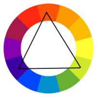
Triadic colors as the name suggests is a pair of three colors equidistant from each other on the Color Wheel. They are generally fun paired and sparks bright and happy combinations. They are mainly used in Interior Designing.

TETRADIC COLORS
Tetradic colors refers to a color scheme of 4 colors equidistant from each other on Color Wheel. All 4 colors are selected evenly so there is no clear dominance of one color. Tetradic (double complementary) Color Scheme is always vibrant and colorful.
Color Shades, Tints and Tone
Color shades, tints and tones are made by mixing colors with black, white or gray. When added with these neutral colors, they have different variations which are used in backgrounds. Combining colors generate a whole range of color schemes that are useful and pleasing to the eye.

COLOR SHADES
Color Shades are created by adding black to a color which gradually darkens the shade but hue remains the same. Color Shades are mainly used in search section or footer backgrounds. Color Shades are also used in cosmetics and beauty products.
COLOR TONES
Color Tones are created by mixing gray (equal amount of white and black) to a color. Adding gray to a color, dulls its brightness, so it's added carefully. It results in endless variety of color useful for typographic elements and Geo colors in Maps.
COLOR TINTS
Color tints are created by hue or mixing white color to a pure color. Tinted Colors are paler than their original colors like pastel colors are a perfect example. Tinted Colors are used in backgrounds.

NEUTRAL COLORS
Neutral Colors are hues that appear to be without colors. They are used to compliment primary colors, and you won't find them on a Color Wheel. The four most common Neutral Colors are Black, White, Brown and Grey where Black is the strongest of neutrals. Neutral Colors are used in homes and office spaces as they are easy to blend and easy on the eye.
